Checklist: what customers expect when visiting your online shop
A lot of the time, customers arrive to a website and abandon it immediately. Why? Either because they don’t easily find what they are looking for or because the site does not meet certain standards. However, what are the standards that customers expect when visiting an online shop? To answer that question, we’ve prepared a checklist with the main elements customers and visitors expect in order to retain them in your site and ultimately reduce shop abandonment:
Clear product types, logo and branding:
Your products should be in the spotlight on your homepage, meaning that they should be clearly visible as soon as a visitor enters your site. It does sound obvious, but there is no bigger conversion killer than a customer visiting an online shop and not being able to identify what the offering is. Your selling proposition should be so easy to understand that your customers can see within seconds that you are, for instance, selling sport clothing instead of camping material.
Besides that, your logo and brand are other visual key point to easily offer an idea of your business and your shop in an instance. Your images, colours and structure in the shop make a difference between a shop that welcomes visitors and a shop that makes them abandon immediately.
As you may imagine, customers would rather come in a physical store when it looks bright, tidy, appealing and organised, wouldn’t they? So same for an online shop! Most of the time, branding helps build trust and makes customers buy depending on how they view the brand.
Search function
The larger your product catalogue, the more important the sites search function is in order to provide a great user experience for your customers and for your ecommerce success. The search function is often displayed in the upper area of your online shop and customers are used to finding it here and using it to find with ease what they are looking for.
Quality product pages
Too often it happens that customers go and stay in an online shop looking for a product and information about it: size of the product, how much it costs, what it is made of… Your product pages are the information king to solve all these questions – not only with descriptions and facts, but visually too. These pages should enable customers to imagine how great they would feel using that product and they should answer all questions surrounding the purchase of that product.
Returns and deliveries
Once a customer has made the decision to buy, that is the moment an online shop has to quickly and easily overcome any questions about delivery costs and returns. That’s why it is vital to provide a complete overview of your return policies.
Best case is to have a dedicated page to inform about both the return and delivery process, including all the pricing around it. Customers hate being surprised with additional costs at the checkout for things as delivery. Make these costs transparent through the whole purchase process: no surprises, no last minute costs.
Trust badges and payment options:
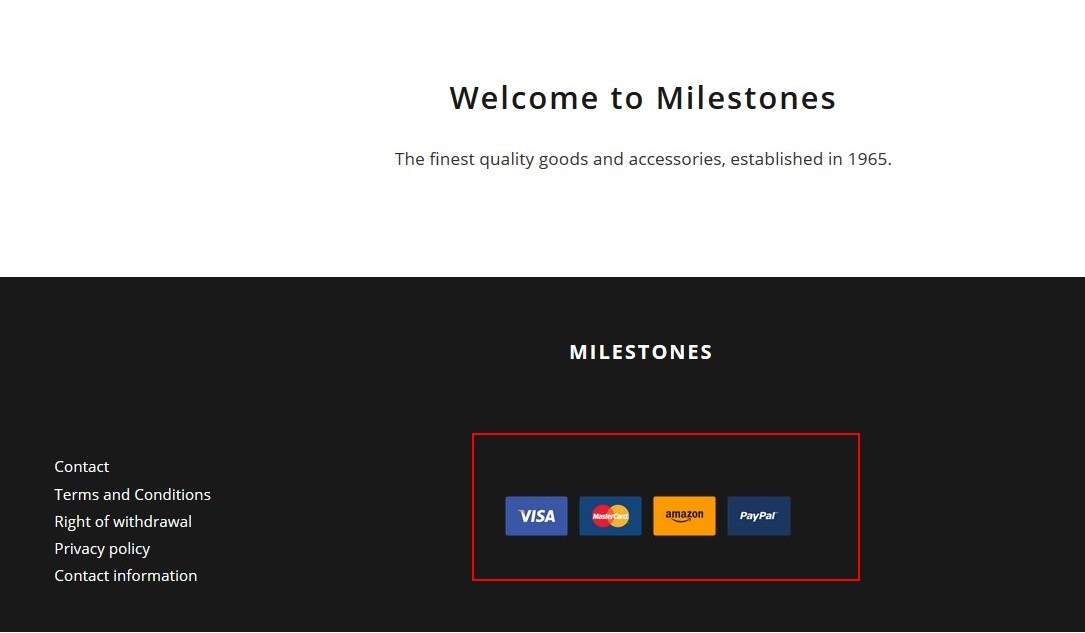
Your customers also want to see if your shop is trustworthy. The best way to achieve this is by providing them with a range of well-known payment options and trust badges such as Trusted Shops. This information should be displayed in the footer or header of your home page so it is immediately visible for all your visitors.
User generated content: reviews, testimonials, etc.
Seeing customer reviews, ratings, and testimonials is another strong way to build trust for your visitors: they can see the experiences others had with your product or service.
Customer information:
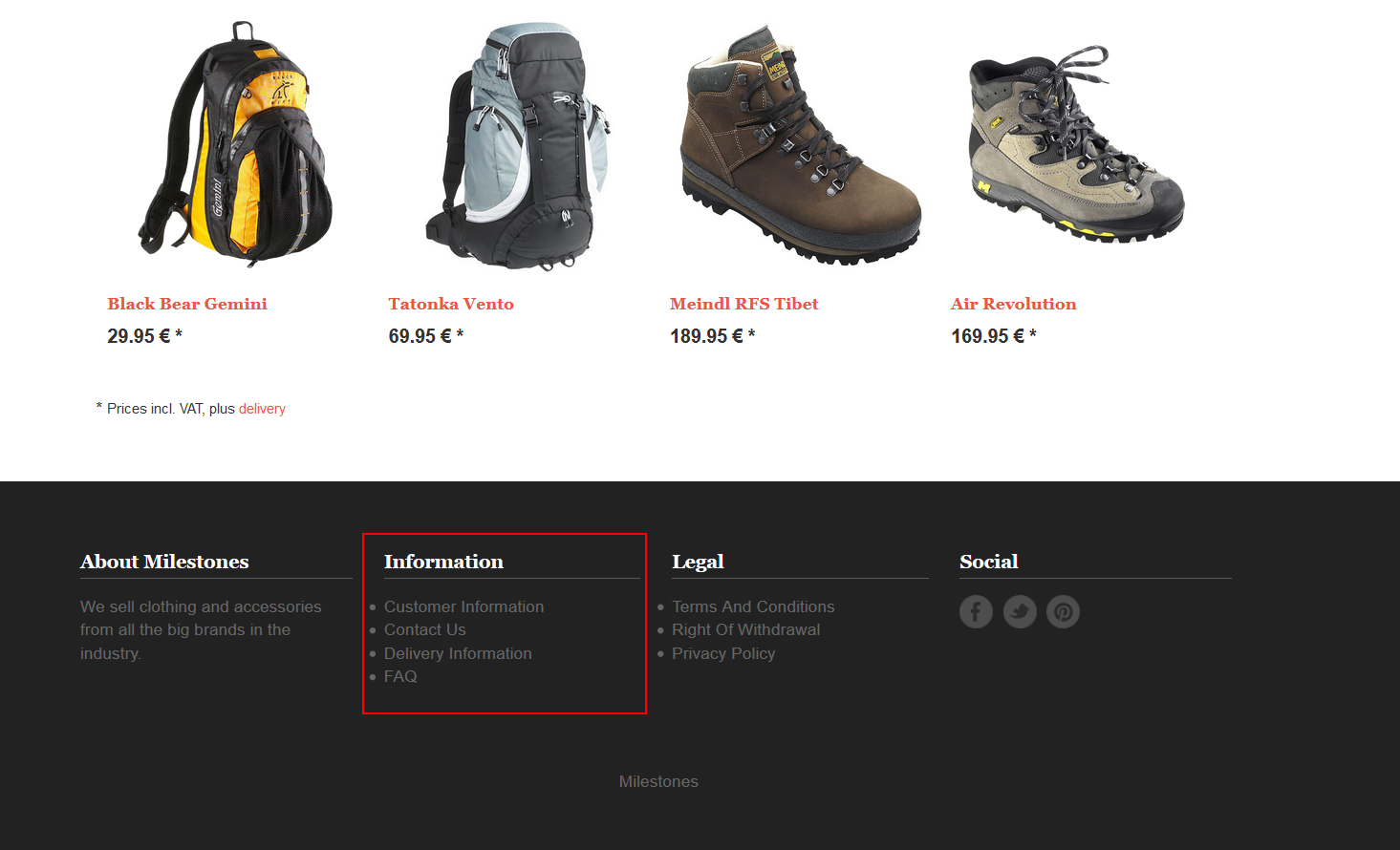
“What happens if my order does not arrive or something goes wrong?” Hopefully that won’t happen, but the truth is that customers also want to know how they can contact you if something does happen. In fact, they still expect an online shop to offer the same customer support and interaction that a physical store offers. For example, contact information, social media channels to see how you interact with your customers, or an “about us” page to know more about your team and business. The best way to communicate this is to place all of this information in the footer together with the return and shipping policies.
On and offline integration
Additionally, some customers still prefer to research items online and buy them offline or buy them online and collect & return them offline. Either way, there is always a trustful aspect about an online business having a local address. No matter whether it is only a warehouse, a proper brick and mortar store or a temporary stand in a local market, customers will always appreciate having a place to go to or to call before, during or after the purchasing process.
This will not only show customers that you want them to keep in touch with you and that you care about them, but will also help build trust and reduce the barrier of online shopping for potential shoppers. As well as the customer service, this information can be placed either in the “about us” page or on a dedicated page for announcing seasonal local markets or specific events.


Leave a Reply
Want to join the discussion?Feel free to contribute!