
The power of colours in ecommerce: How to use them effectively for your online shop
Did you know that the right use of colours can have a positive impact on your sales? The main reason behind this are psychological patterns associated with colours that you can benefit from. Our design experts will give you valuable tips on the right combination of colours and show you how to use them for your company, your products and your online shop.
How do colours work?
To understand how colours influence our buying behaviour, let’s first take a step back.
Looking at the basic colour theory we know that colours are divided into primary, secondary and tertiary colours. This can be seen particularly well in Itten’s colour circle:
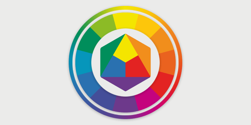
Der Farbkreis nach Itten (1961)
The primary colours are basic colours and cannot be mixed. The secondary colours are created by mixing two primary colours (e.g.: yellow + blue = green). In the further mixing process, this in turn results to tertiary colours, meaning clouded colours of the secondary colours (for example brown).
What we associate with colours is deeply rooted in our consciousness. Reasons for this are social patterns, cultural background and personal taste. Certain colours could even affect a person’s behaviour and emotions. These are often the primary and secondary colours, as these appear most often in our environment.
The colour lexicon for targeted marketing: How colours influence our buying behaviour
Brand colours accompany us every day. Think of Apple, KFC or PayPal. Every brand has its own colour scheme that supports the meaning of the company. This in turn increases brand recognition, according to a study by Kissmetrics.
Primary and secondary colours in particular have certain meanings in marketing that are related to colour psychology. The field of neuromarketing combines impact psychology with marketing and advertising strategies. Our colour lexicon gives you an overview of the psychological significance of the most used colours in marketing:
Red
According to experts, red is considered a warning colour, one example being traffic signs. It suggests energy and urgency. Red achieves the greatest physical response: When we are exposed to red, our pulse quickens, which can be particularly effective for impulsive purchases. Red is suitable for special offers as well as for the food industry, as the colour stimulates the appetite. (Example: Target, KFC)
Blue
We often associate blue with the sky or the sea, so the colour has a calming, yet strengthening effect. In advertising, blue signals trust and security. This is particularly important for medicinal or drugstore products as well as in finance. (Example: Unilever, Oral-B or IBM, PayPal, etc.).
Green
You have probably come across green on organic products. This is no coincidence, because green stands for naturalness, hope and relaxation. In contrast to red, the colour has a rather calming effect. The colour is particularly suitable for wellness and health products.
Yellow
Yellow stands for youthfulness and optimism. It is not a coincidence that McDonalds chose this as its brand colour.
Orange
The interplay of yellow and red (energy and optimism) results in orange. Orange combines these emotions and stands for friendliness, self-confidence and cheerfulness. Together with yellow and red, it is generally regarded as an activating colour. (Example: MasterCard, Fanta, Amazon)
Black/White/Grey
All shades on the scale from black to white are often considered “neutral colours” for products and logos. In colour psychology, they stand out above all for their strength, elegance, modernity, functionality and seriousness. They are particularly suitable for technical devices and luxury products. (Example: Apple, Wikipedia)
This is what you should consider for your marketing strategy
In order to use the colours specifically for your marketing, think about the following questions beforehand:
- Which industry do you identify with most?
- Which brand and product colours do your competitors use?
- How do you want to position your products? What values do you want to emphasise?
- What is your target group?
Would you like to learn more about how to build a brand? Then we recommend our blog article on branding.
Combining colours correctly: Tips from our design team
Do you already have ideas about which colours you want to use for your brand or online shop? The next step is to work out the right colour combination.
The ePages design experts have prepared the most important tips for you:
Define your colour palette
To create a recognition value and visual order, you should define a colour palette for your brand. This defines the colour scheme for your entire shop. Generally, 4-6 colours (excluding white) is considered an optimal number. Refer to our guide for this:
- Colours that are close to each other on the colour circle usually harmonise well with each other. Such a colour combination is called an “analogue colour scheme”.
- Do you only want to use one brand colour? In this case, the colour palette can be supplemented with achromatic colours like greyscales. In this case, however, the brand colour should be used as an accent colour and therefore be striking.
- Too many strong colours in your colour palette can quickly become restless and prevent the reader from understanding the sequence of information. Therefore, work with tone gradations. In this method, you choose your starting colours, one of which is the accent colour. You can then gradate this by brightness and saturation and create two darker contrasts, for example.
Using this as a basis, our ePages design team has put together an example colour palette for you:
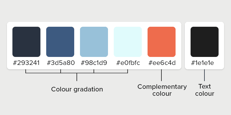
Example of a personal colour palette
Need inspiration for your personal colour palette? You can find more ideas for colour palettes and suitable combinations at Coolors, for example. There you can find colour codes, also called hex codes, which you can insert directly to your colour selection in the shop.
Pay attention to the colour distribution
Before you apply your standard colour palette to your online shop, you should pay attention to the correct distribution, because not every colour tone should be used equally. The rather subtle colours (such as your gradations) can be used well for the background, while the more striking colours (your complementary colour) are suitable for highlighting.
If you decide to use several striking colours, never use them on top of each other (e.g. a striking font colour on top of striking button colour). It is better to use these next to each other. For example, you can complement an eye-catching button with a coloured headline:
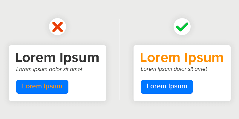
How to combine complementary colours
The following applies to font colours: Headlines can be highlighted well, the body text not so much. Instead, work with greyscale or white in body text. Pure black is rather unpleasant for the reader, so we recommend a darker shade of grey.
How to use colours in your ePages Now Shop
Are you ready to optimise your colour scheme? Then read more about the options ePages Now offers you to easily adjust your colour design:
- Background colours. With your shop, you have the option to set background colours for content elements. Read more about this in our blog article on the new functions of ePages Now.
- Colour in content elements. The individual content elements offer several options for customising the colour design: Here you can select the text colour, button colour and colour overlay for images within just a few clicks. You can edit this directly in the live preview.
- Your theme colours in the quick selection. You have quick access to your personal colour palette via the additional bar in your colour selection, in which the last applied colours are stored.
- CSS codes. Experienced users have the option of further personalising the online shop with CSS codes. We have provided a few basic CSS codes with instructions for you here. Among other things, you will learn how to change the background colour of the USP bar located in the header, the colour of the icons or the font.
- HTML element. As an alternative to CSS codes, you can add an HTML content element. With additional HTML codes, this allows you to further personalise your design.
Did you enjoy this article? Subscribe to our newsletter for more tips on optimising your shop and not to miss our updates on the latest features!
Als Content Manager bei ePages ist Sarah für redaktionelle Inhalte und Videocontent zuständig. Im ePages-Blogstellt sie Onlinehändlern Marketingtipps, rechtliche Updates und Infos zur ePages-Software zur Verfügung, um ihnen den Einstieg in den E-Commerce zu erleichtern.
This post is also available in:


Leave a Reply
Want to join the discussion?Feel free to contribute!