How to increase sales with a simple search box
The vast majority of online stores have the same problem; not everyone who visits will buy something. Indeed, 92% of people who visit an online shop have no immediate intention of buying anything. Worse still, of those who choose to buy something and load up their shopping cart, a large number will abandon their intended purchase. Thus, getting people to buy from your website can sometimes be a struggle.
Well, it’s a problem if your name isn’t Amazon or eBay. They appear to be doing OK in getting people to buy from them. So, what are they doing right that many other e-commerce websites are failing to achieve? The answer can be found in some new research on what people like most about online shops.
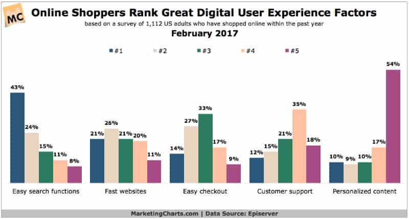
In this study, people were asked to rank five elements of a shopping site in order or priority.

Infographic by www.marketingcharts.com
The most important aspect of a good Internet shopping site was having a search box. Just consider what you do when you go to Amazon. You go straight to the search box (which is top middle of the page) and start typing. If you use Ebay, you do the same. And guess what is top middle of Alibaba (the world’s biggest retail site). Yes, you got it right, there’s a great big search box.
Many online shops favour something known as “the mega menu”. This is a menu that expands, often to fill an entire screen, allowing you to see what is in every corner of the store. That’s not what Amazon, eBay or Alibaba do. True, they have menus, but they have great big, obvious search boxes all in the same place. Plus these search boxes are in the same place as Facebook’s search box and roughly similar to where Google puts its search box on a Chrome start-up page, for instance.
Most people’s experience of the web is with Google, Facebook and other highly popular sites, such as Amazon, Ebay, Twitter and so on. They all share one thing in common – a search box in almost exactly the same place.
So, when people visit any other website, their natural instinct (based on hours of experience with the most popular sites) is that you get to what you want simply by searching. If an online shop does not have an obvious central search box, people find it harder to use the site.
Why then do so many retail sites not have a search box? Well, that’s because they are built by retailers. People who work in retail think in “departments”, “categories”, and “product lines”. Many online shops reflect this by forcing you to visit a particular department before you can find what you want. It is as though the retailers are trying to recreate a physical store on the web.
However, that’s not the way people use the Internet. Instead, we tend to search for things because that is what we are used to doing.
People have a strong preference for convenience. It is part of our survival system because the more energy we can conserve, the more we are able to escape from danger. Hence your brain constantly wants you to do things in the simplest and quickest way possible. Search is that solution, so we have a strong tendency towards it.
You can certainly increase your sales by having a search box on your website. It may even help increase conversions too, thereby reducing cart abandonment, because people have a liking for sites that are convenient to use.
es responsable de marketing en Clickworker.


Leave a Reply
Want to join the discussion?Feel free to contribute!