Buttons, background colours and more: These are the new features in the editor of ePages Now
Using the features available in the editor of ePages Now, you can give your online shop a more personal touch. Find out below how to individualise colours in your online shop. And we’ve just made it even easier to navigate through the pages of your online shop. In this article, we present the latest developments available for your ePages Now shop.
Quick selection of theme colours in the Cockpit
To more easily bring your brand identity across, we have pinned a selection of your individual theme colours in the colour selection in the editor. With this palette, you can quickly access the colours that have been previously used in your shop:
Consider using your brand colours, for example those in your logo. That way, you can give your overall appearance a higher recognition value.
How do colours influence consumer behaviour?
The use of colours is an important foundation for any business aiming to be successful in their branding. Among others, research by neuroscientist Antonio Damaso backs up this statement: Decisions a person takes are mainly emotional, not logical. One of the easiest ways to trigger emotions is through the use of colours.
Let’s apply this to a customer’s buying decisions. You have probably already detected recurring colour patterns in your personal buying behaviour: Organic products are green, discount promotions are bright red. These colours arouse positive emotions and get consumers in a ‘buying mood’. This works with different wavelengths of the colours, which generate socially conditioned emotions when viewed. Red as a commonly known warning colour triggers a quick reaction in our brain, which is why we like to grab sale products when shopping.
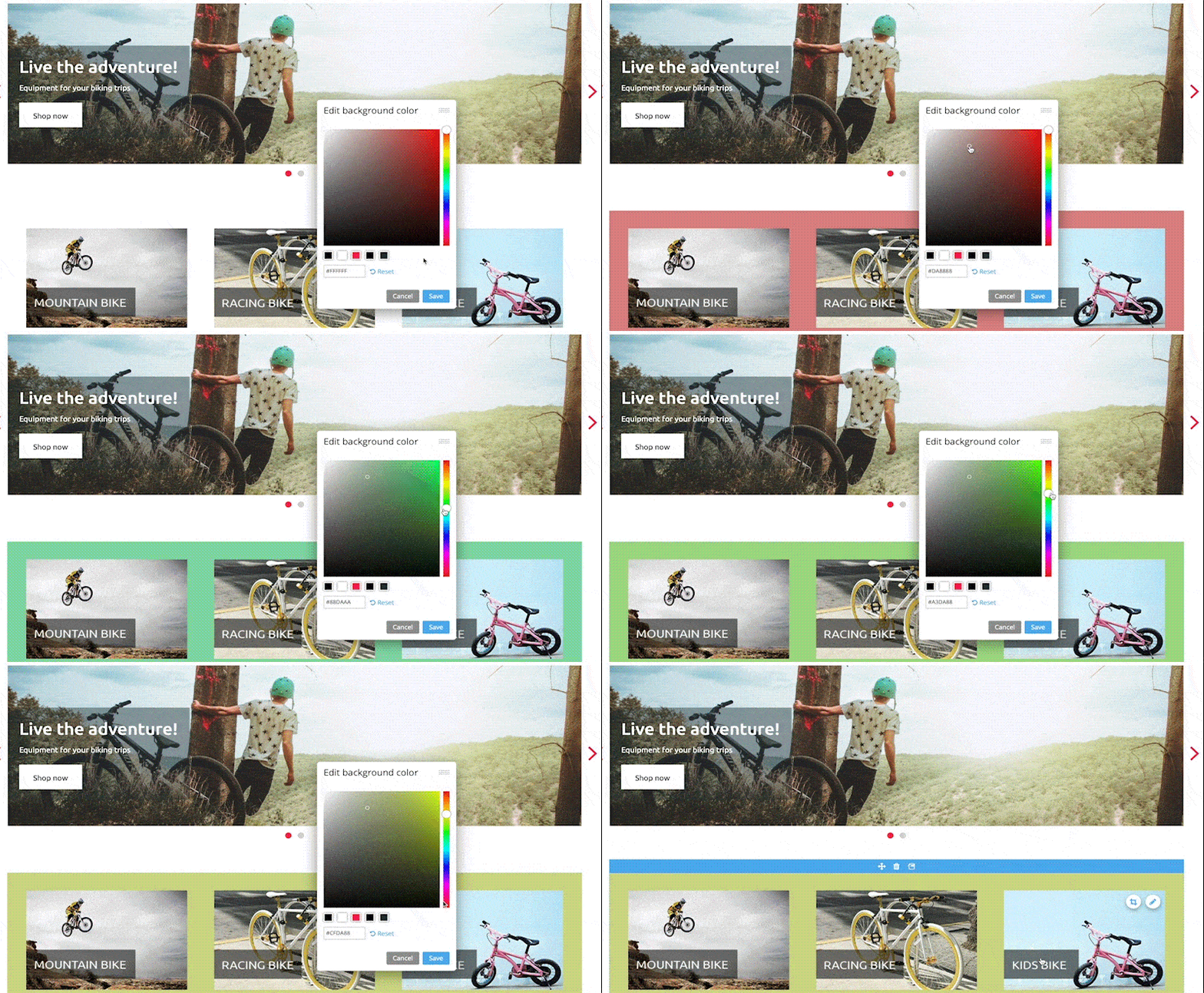
Background colours for content elements
Background colours are another way to boost the appearance of your shop. You can apply these to any content elements. Colour blocks not only bring the advantage of recognition value, but are also beneficial for the structure of your website. As with the classic choice of colours, such as font colours, you can freely select the background colours. Here you also have the possibility to pick one of your theme colours for the background.
Call-to-action buttons in texts
New Call-to-Action (CTA) buttons enable you to steer your customers through the content of your online shop via links. The term “call to action” is commonly used in marketing to refer to a request for a user’s action, often in the form of a button. A CTA button can be used, for example, to promote certain product categories or to highlight a product of the month. You can also add a button to the “About Us” page linking to other existing texts, such as a short introduction of your shop on the homepage. Common examples of how CTA buttons are labelled are as follows:
- View product
- About Us
- Learn more
- Go to the blog article
- Buy now
- Discover new products
- Go to sale
CTA buttons can now be inserted into any text element from your shop and offer you more freedom to restructure its appearance. Such links are particularly useful for the homepage.
In the shop, internal as well as external content can be linked via a button. Perhaps you are positively featured in a blog article or would like to promote another external site. You can, of course, adjust the text on the button freely. You are also welcomed to get inspired by these examples.
Sort content pages in the footer menu
If you would like to sort the order in which the pages in your footer menu display, you can now do this per drag and drop. In the footer menu settings, where you see this symbol ![]() to the left of your pages, simply click on this area and drag pages to the desired position.
to the left of your pages, simply click on this area and drag pages to the desired position.
ist Product Owner bei ePages.


Leave a Reply
Want to join the discussion?Feel free to contribute!