The right typography for your online shop
Designers often say that the text makes up 90% of a website’s design. Whether or not that’s true, textual aspects certainly contribute to the user experience. In this article by our Product Manager User Experience Lukas Rathmann, you can read about the things to watch for with regard to text and learn how effective typography can improve your shop’s conversion rate.
Appealing design, good-quality product images and user-friendly navigation: all these and many other factors can affect a user’s experience of an online shop. When optimising their shops, however, many merchants tend to forget the major role played by text in the site design. Apart from enhancing the actual content of the copy, it’s also very important that we consider the visual impression made by the text.
There are two main objectives to bear in mind concerning text design: firstly, it should contribute to the shop’s overall visual style and, secondly, it should provide visitors with a straightforward, pleasant reading experience. This second aspect – readability – should always be prioritised.
Selection of fonts
When choosing fonts, there are several factors to consider.
Content
Not every typeface is suitable for every type of content. Certain fonts, for instance, have been explicitly developed for use in headings and can therefore only be used in limited ways for other types of content such as body copy or button labels.
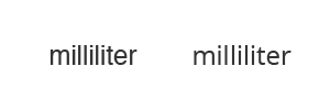
Helvetica (left) and Open Sans (right) – At smaller font sizes, Open Sans has a higher readability
Style
Some typefaces are very generic and neutral, whereas others project a distinctive, individual style. Important issues here are the target audience and the branding. For example, you wouldn’t expect to see a clumsy, old-fashioned typewriter-style font used for an elegant bridal wear shop.
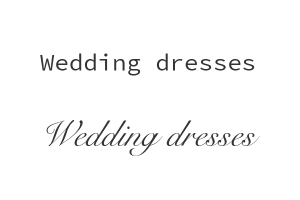
Source Code Pro and Snell Roundhand
Font combinations
Typically, if two fonts are to be used, we distinguish between one typeface for headings and another for the body copy.
We’d recommend that you avoid using more than two different typefaces on your website. There’s a simple reason for this: the more fonts you use, the harder it will be to combine the fonts effectively.
In any event, when selecting your typefaces you should aim to achieve a good level of contrast between the two styles, which should therefore not be too similar. Very often, a distinctive typeface, such as a serif font, works well in combination with a more neutral, generic font.
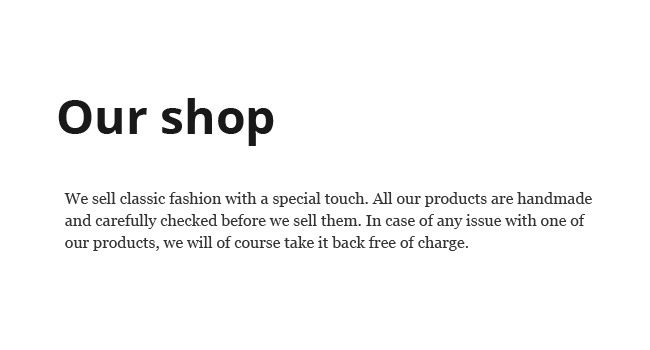
Open Sans (headline) and Georgia
Of course there’s no rule that says you have to mix two different typefaces. It can often be effective simply to use different styles of the same font – such as “Normal” and “Bold”.
Open Sans bold (headline) and normal
Other factors to consider
When designing text, you should follow certain basic rules:
- The text should be correctly formatted from a semantic point of view. In the ePages WYSIWYG editor, you can choose between different formatting options. For the body copy, you should always select the “Normal” font style. Top-level headings should be formatted as “Heading 1”, the second-level headings one level down as “Heading 2”, and so forth.
- If key words are emphasised (by being shown in bold, for example), they will not only stand out more for the reader, but search engines will also be able to capture the website content more easily and classify it correctly.
- The contrast between the type and the background should always be sufficiently clear. On a white background, for instance, light-grey text can be difficult to read.
Things to avoid
Even if modern tools offer us all kinds of options for manipulating text online, they should be used with caution. When aiming for legibility, the well-known rule applies: less is more. Below we’ve compiled a list of various options you should probably avoid:
- Changing the pre-set text colour and background colour for your shop theme
- Justifying or centering your body copy
- Modifying the predefined line spacing for your shop theme
- Mixing different font sizes within the body copy
- Using more than one alignment option
- Using too many format styles together (such as bold and italic)
- Strikethrough text (except to show where a higher price is no longer valid)
- Underlining text (apart from in links)
- Using upper and lower-case formatting in an unusual way
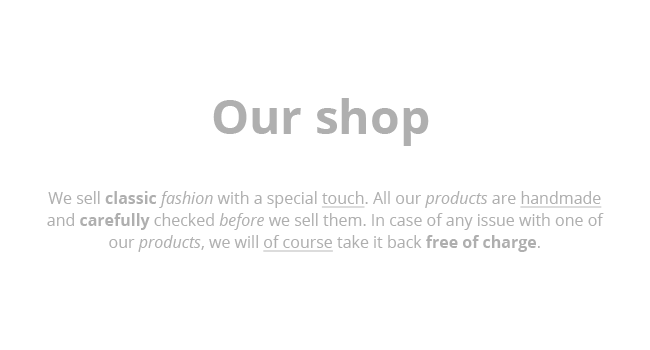
Centered, low contrast, a lot of bold and italic text – the readability of this text is low
ist Product Owner bei ePages.


Leave a Reply
Want to join the discussion?Feel free to contribute!