The perfect product page
To buy or not to buy? Your customers mostly ask this question on your shop’s product pages. We will explain how you can prompt your customers to buy through the use of attractively designed product pages.
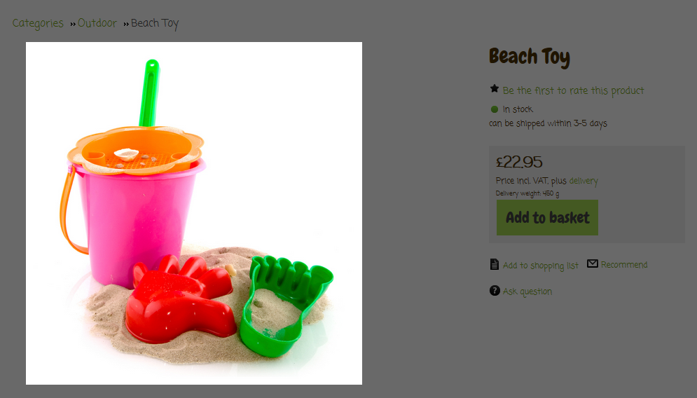
There is a separate product page for each product in your shop. Here is where you provide your customers with all the information they need for their purchase decision. We present the individual elements of the product page below and show you what you need to look out for.
The most important elements of the product page
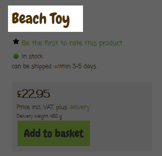
Product name
The product name is displayed in a prominent position. Choose a compelling, unmistakeable name. When giving a name, imagine that you are the customer – what kind of name would the customer give the product? What would the customer use as an Internet search term? If you are selling branded products, it is essential that you mention the brand in the name.
Product photos
Display your products on a row of high-quality images – preferably from all sides. Images should have a minimum width and height of 1000 pixels. The larger your images the better.
Your shop system has a zoom function available: when a user moves the cursor over the product photo, a small window opens and a close-up is shown of the relevant area on the product photo. The user can then comfortably examine the details of the product photo. You can activate the zoom function under Settings >> Product settings.
Product description
The product description is the centrepiece of this page. Try to answer all your customer’s questions. What does the product feel like? How big is it? Is it easy to use? A detailed product description can also avoid returns.
The product description is equally useful to both prospective customers and search engines. Google and all the other search engines record the text on the product page and this is taken into account in the search results. So use the correct key terms in the product description. If a customer is searching for these terms, they may come across your shop. Always use your own texts and do not just copy the manufacturer’s description onto your site. Search engines love unique text, which can’t be found anywhere else on the web.
Price
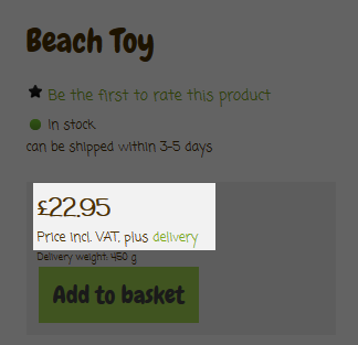
For many online shoppers, the price is crucial. For every product you can quote a price comparison which is then displayed in addition to the current price. The customer can therefore see how much they are saving. Use Settings >> Product settings >> Texts to establish whether the saving ought to be additionally displayed as a percentage or an amount.
Product reviews
You are bound to have read product reviews yourself when shopping online. According to a current survey by IT provider Novomind, 81 per cent of online shoppers consider product reviews by other customers as “important.” This view is even more pronounced among younger online shoppers compared to older ones.
Product reviews have several immediate advantages for your shop. Positive reviews prompt potential customers to buy. Many product reviews convey a feeling of confidence among wary customers. And even in the case of critical reviews and comments, visitors can find out about the possible drawbacks of the product. They then might order a different product, but are ultimately happier and will not return the product later on feeling frustrated.
Use Products >> Product reviews >> Settings to allow only registered customers to review your products and so that all reviews can be checked before publication on your site.
Availability
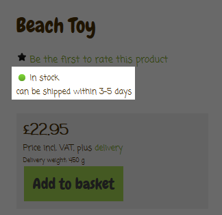
Many online shoppers are impatient. They would prefer to receive their ordered goods immediately. In your shop, visitors will see whether the products they want are in stock. Use Settings >> Product settings >> Availability to specify which information regarding availability is displayed, such as how long for delivery. If you want to, you can also notify customers automatically to let them know as soon as a sold out product is available again.
“Add to basket” button
By clicking on this button, the customer places the product in the basket. Use Settings >> Basket settings to customise the design of the button. Make sure that it is big enough and contrasts sufficiently with the rest of the page.
Asking a question
Clicking on “Ask question” takes the user to a contact form where the customer can send you an e-mail. The customer may only be briefly interested in the product or will shortly buy it from another shop. It’s therefore important that you answer all questions as quickly as possible. Consider copying the answers into your product description – there may be more visitors with the same question.
Social media buttons
Social network buttons like Facebook and Twitter enable your customers to share interesting products with their group of contacts. With a click on one of the buttons, a link to your shop appears in the user’s history and in the best case scenario will direct other visitors to you.
Select the social network you want to (de)activate under Marketing >> Social Web. Then you can establish using the “On product pages” option whether the relevant buttons should be displayed.
Cross-selling
Imagine that a customer is buying a smartphone in your shop. Wouldn’t it be great if the same customer were to buy a second charger cable, loudspeaker and a case at the same time? You can encourage your customers to think about this thanks to the cross-selling function of your online shop. You can establish a range of add-on products, accessories or even alternative products to accompany each product. Or, you simply activate the “Auto cross-selling” function, which, using shop statistics, automatically recommends products to the customer that other users have also ordered with the product in question.
ist Head of Marketing bei ePages.




Leave a Reply
Want to join the discussion?Feel free to contribute!