Designing an Online Shop – Tips and Tricks
Neuromarketing studies have shown that emotional activity in a customer’s brain decreases after just eight seconds. You must strive during this brief time span to get people enthusiastic about your online shop and your offerings. The single most important factor? A well-designed shop! But what should you keep in mind while sprucing up your shop? Continue reading the ePages blog to learn about four field-proven principles.
Do not overwhelm your customers.
Your online shop’s home page is the online equivalent of a storefront. You can use your home page to win over customers’ trust. You should therefore invest a great deal of effort in it. Unfortunately, a lot of online merchants make the mistake of cluttering their home pages with too much information. Consequently, customers cannot find their way around and exit the site without making a purchase. You therefore should not cram all of your products into your home page. Instead, use your home page to set the stage for shopping. Large-scale, high-quality and topic-specific images on your home page enhance your entire online shop. Doing so also frees up space for you to promote certain products as discounted items. You can also utilise your home page to draw attention to categories. You should use large-scale, topic-specific images here, too; manufacturers sometimes provide such images to merchants.
Accentuate your products
Use as many product photos as possible on product pages. Every single image helps turn interested visitors into paying customers. Use merchants’ product images or – better yet – make your own photos. You should do this, however, only if you have the necessary equipment, such as professional lighting. Your product images will otherwise seem quite unsightly and shabby.
Products are typically photographed in front of a white background. We therefore generally recommend that you similarly use a white background for those sections of your online shop where you will present products. Images will thus fit in well with their surroundings.
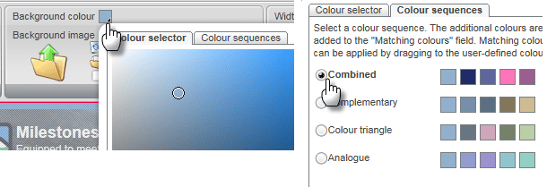
But do not forget to add flourishes of colour to your online shop, either. In menus or the page elements, perhaps, which appear near your products. Do make sure that you choose colours which harmonise. ePages offers a colour manager precisely for this purpose; it suggests a suitable set of colours for any colour you select. . There are also alternative tools online such as Adobe Kuler.
The colour manager by ePages is in the Design menu:

Make the most important elements easy to find
A field-proven rule for websites states that you should always place the most important items at the top of the screen – ideally, in the upper right. Users are accustomed to looking there for key information. The two most important things you should make clearly visible at the top of your online shop: a clearly portrayed shopping basket and the product-search function.
If you want to convert interested parties to customers, you must ensure that people in your shop always know which step they must take next to complete the process of buying something. We therefore recommend using colour or a large format to emphasize buttons which are essential to the buying process. While you are selecting graphics for buttons, make sure you choose an icon set familiar to your customers. The symbol for "Add to shopping basket", for example, should be instantly recognizable. Accepted methods of payment are also significant concerning the buying process. You should therefore prominently display the logos of all payment providers on every page.
In general, you should guide customers through your shop. A navigation bar and properly organised categories will help them to get oriented quickly. A "bread crumb" – in other words, showing the current menu item as a path – can also help customers. Because users look first to the footer (the section at the bottom of a web page) if they want to find mandatory information –such as a site’s legal notice or links to contact options – you should place such information in the footer.
Volker Schwarz
Volker Schwarz studied German, History and Politics at the Ruhr-Universität Bochum. From 2004 to 2009 he worked as a freelancer for several marketing and communications companies in Hamburg, including e-commerce companies. Between August 2009 and December 2011, he worked as an online editor at ePages.


Leave a Reply
Want to join the discussion?Feel free to contribute!